FlutterArtist Themes FaColorUtils
In the Flutter ecosystem, widgets never exist as color islands. They follow a mechanism called Theme Propagation. Most standard widgets do not hard-code their colors; instead, they "query" ThemeData, specifically the ColorScheme, to determine their appearance.
ElevatedButton
Take ElevatedButton as a prime example of semantic color dependency. When you place a Button in your UI without configuring any specific colors:
ElevatedButton(
  onPressed: () {},
  child: const Text('Submit'),
)
The system automatically performs an underlying logical mapping:
- Background color → Automatically maps to Theme.of(context).colorScheme.primary.
- Foreground color → Automatically maps to Theme.of(context).colorScheme.onPrimary.
This mechanism ensures contrast standards are met without manual calculation.
The problem arises: When the Palette is insufficient
Flutter's approach is great for small apps. However, as your UI system evolves into complex applications with hundreds of data types, you'll notice a "semantic gap":
- Semantic Ambiguity: Should colorScheme.tertiary be used for "Warning" states or decorative elements?
- Data Consistency: Should a Data Label and Data Value both use onSurface? If they share the same color, how can users distinguish property names from values?
- Maintenance Burden: If you need to change the color logic for Success states in Dark Mode, you would have to find and update numerous locations in your source code.
Flutter provides a Palette, but it lacks a Semantic Layer to define: "What is this color used for?"
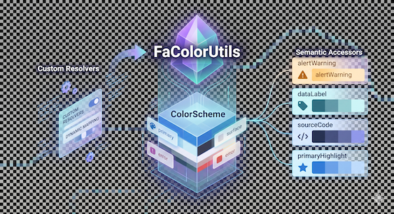
The role of FaColorUtils: The Semantic Bridge
FaColorUtils was created to fill that gap. It acts as an Abstraction Layer sitting atop the ColorScheme. Instead of naming colors by their physical traits (Green, Red), we name them by their intent of use.
// Instead of:
Text("Warning", style: TextStyle(color: Theme.of(context).colorScheme.tertiary))

// Use:
Text("Warning", style: TextStyle(color: FaColorUtils.alertWarning(context)))
This makes your code "Self-documenting." Anyone seeing FaColorUtils.dataLabel(context) instantly understands it belongs to a data label.
Use FaColorUtils when:
- Building Custom Widgets or project-specific UI components.
- Displaying System States like Success, Error, or Warning.
- Presenting Complex Data like Data labels, Values, Timestamps, or Source Code.
1. FaColorUtils & FaColorResolvers Architecture
In FlutterArtist Theme, the color system is split into two distinct layers:
- FaColorResolvers → defines how colors are resolved
- FaColorUtils → provides semantic access to those colors
With this architecture:
- You can centralize color logic in one place.
- And consume colors semantically across the UI
Example:
This Resolver defines how to obtain the primary content color.
FaColorResolvers *
/// Primary content color for main text and key data.
static FaColorResolver primaryContentResolver =
    (context) => Theme.of(context).colorScheme.onSurface;
FaColorUtils acts as a semantic API layer.
FaColorUtils *
/// Primary content color for main text and key data.
static Color primaryContent(BuildContext context) =>
    FaColorResolvers.primaryContentResolver(context);
Use in UI
You don’t care about the exact color — only that it represents “primary content”.
Text(
  'Hello World',
  style: TextStyle(
    color: FaColorUtils.primaryContent(context),
  ),
)
Customize the color system.
The biggest strength of this architecture is its override capability. You can change system-wide behavior by reassigning a Resolver:
MyDemoAppConfiguration (*)
class MyDemoAppConfiguration extends AppConfiguration {

  @override
  void overrideColorResolvers() {
    FaColorResolvers.primaryContentResolver = (context) {
      final scheme = Theme.of(context).colorScheme;

      // Example: slightly dim content in dark mode
      if (Theme.of(context).brightness == Brightness.dark) {
        return scheme.onSurface.withValues(alpha: 0.9);
      }

      return scheme.onSurface;
    };
  }

  // Other codes..
}2. New 1422874
New fragment 1422876
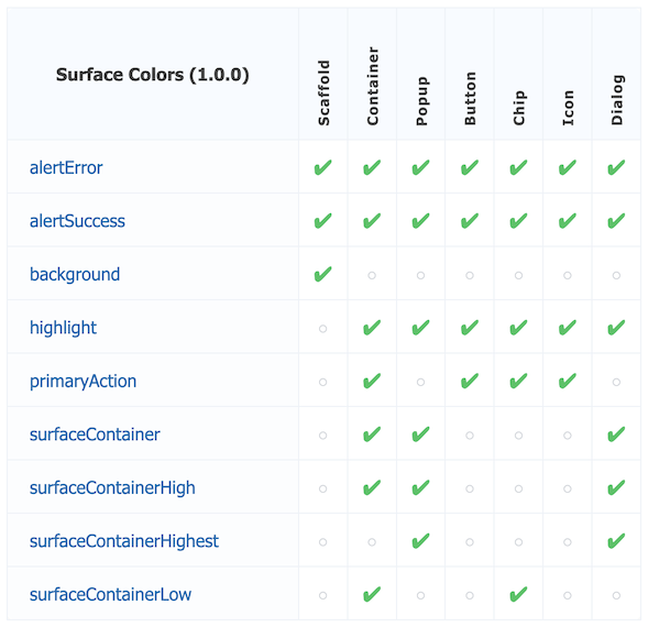
Surfaces & Backgrounds
background(context):
- The base background color for major screens (typically used for Scaffold).
surfaceContainer(context):
- The standard surface for content blocks like Cards or Panels.
surfaceContainerLow(context):
- Low-emphasis surface, ideal for Sidebars or secondary areas.
Actions & Highlights
primaryAction(context):
- Primary brand color used for main call-to-action (CTA) buttons.
highlight(context):
- Background color for selected elements or areas that need special emphasis.
onHighlight(context):
- Content color (text/icon) displayed on highlight backgrounds. Ensures perfect contrast.
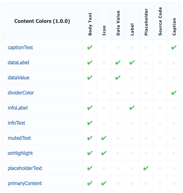
Nội dung & Văn bản (Content & Typography)
primaryContent(context):
- Primary text color for the entire interface, ensuring maximum readability.
mutedText(context):
- Muted text color, used for secondary or low-priority information.
Data & Technical
This group is extremely useful for Dashboard or Tooling applications where data needs to be displayed clearly.
dataLabel(context):
- Color for data labels (e.g., "ID:", "Created at:"). Typically medium emphasis.
dataValue(context):
- Color for the actual data values. High contrast for readability.
technicalHighlight(context):
- Highlight color for technical metadata or system status badges.
sourceCode(context):
- Specialized color for source code snippets or code identifiers.
Status & Alerts
Besides Error and Success, there are other important intermediate states.
alertWarning(context):
- Warning color (typically yellow/orange), used for actions requiring caution.
alertInfo(context):
- Informational color (typically blue), used for guidance or notices.
alertNeutral(context):
- Neutral state color for non-emotional notifications.
Tương tác & Trạng thái (Interaction States)
It helps the interface respond dynamically to user actions.
interactiveHover(context):
- Color overlay when the user hovers over an element.
interactivePressed(context):
- Feedback color when an element is pressed or active.
disabledBackground(context):
- Background color for disabled components.
disabledContent(context):
- Content color (text/icon) for disabled components.
Structure & Navigation
navItem(context):
- Default color for navigation menu items.
navItemActive(context):
- Color for the currently active navigation item.
borderDefault(context) / borderStrong(context):
- Border levels from standard to strong to separate UI spaces.
No ADS
FlutterArtist
- FlutterArtist Debug Network Inspector
- Basic concepts in Flutter Artist
- FlutterArtist Block ex1
- FlutterArtist Filter Example
- FlutterArtist FilterModel MultiOptFilterCriterion ex1
- FlutterArtist FilterInput Example 1
- FlutterArtist Form ex1
- The idea of designing filter models in FlutterArtist
- FlutterArtist FormModel.patchFormFields() Ex1
- FlutterArtist BlockQuickItemUpdateAction Example
- FlutterArtist BlockNumberPagination Ex1
- FlutterArtist GridView Infinite Scroll Example
- FlutterArtist BlockQuickMultiItemCreationAction Example
- FlutterArtist ListView Infinite Scroll Pagination Example
- FlutterArtist Pagination
- FlutterArtist Sort DropdownSortPanel Example
- FlutterArtist Dio
- FlutterArtist BlockBackendAction Example
- FlutterArtist BackgroundWebDownloadAction Example
- FlutterArtist StorageBackendAction ex1
- FlutterArtist Block External Shelf Event Example
- FlutterArtist Filter FormBuilderMultiDropDown Ex1
- FlutterArtist Master-detail Blocks ex1
- FlutterArtist Scalar ex1
- FlutterArtist Pagination Davi table Infinite Scroll Ex1
- FlutterArtist Filter Tree FormBuilderField ex1
- FlutterArtist Filter FormBuilderRadioGroup ex1
- FlutterArtist Form Parent-child MultiOptFormProp ex1
- FlutterArtist Manual Sorting ReorderableGridView Example
- FlutterArtist Manual Sorting ReorderableListView
- FlutterArtist Scalar External Shelf Event Example
- FlutterArtist Code Flow Inspector
- FlutterArtist Projections
- FlutterArtist Debug Log Viewer
- FlutterArtist start
- FlutterArtist AppConfiguration
- FlutterArtist Debug App Inspector
- FlutterArtist Debug Filter Criteria Inspector
- FlutterArtist Debug Filter Model Inspector
- FlutterArtist Debug Form Model Inspector
- FlutterArtist DebugMenu
- FlutterArtist Debug UI Context Inspector
- FlutterArtist Debug Shelf Structure Inspector
- FlutterArtist Context Provider Views
- FlutterArtist FilterModelStructure ex1
- FlutterArtist FilterModelStructure ex2
- FlutterArtist FilterModelStructure ex3
- FlutterArtist Internal Shelf Event ex1
- FlutterArtist Deferring External Shelf Events Example
- FlutterArtist Face
- Overview of FlutterArtist Theme
- FlutterArtist Theme Design Tokens Architecture
- FlutterArtist Themes FaColorUtils
- Flutter Artist Theme - Create a custom theme
Show More